

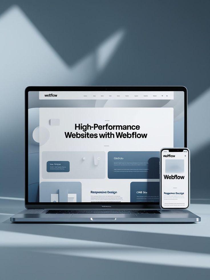

Building a Sales Page in Showit That Converts Enquiries
A beautiful website can introduce your creative business, but sometimes you need a page with one specific purpose: turning interested visitors into enquiries.
That is where a well-planned sales page can make a difference.
Whether you are a photographer, designer, coach, creative freelancer, or service provider, a showit sales page template can give you the structure needed to present an offer clearly. However, simply choosing an attractive template is not enough. The content, layout, messaging, calls to action, and overall customer journey all need to work together.
A successful sales page should answer the visitor's questions, build confidence, explain the value of your offer, and make the next step obvious.
What Is a Showit Sales Page?
A sales page is a dedicated webpage designed around one particular offer or service.
Instead of sending visitors to a homepage with several different options, a sales page gives them a focused experience.
For example, a creative professional might create a sales page for:
-
Wedding photography packages
-
Brand photography
-
Website design services
-
Creative consulting
-
Online workshops
-
Coaching services
-
Design packages
-
Photography mini sessions
A showit sales page template provides a starting layout that you can customize with your own branding, photographs, copy, pricing information, testimonials, and calls to action.
The important part is that the finished page should feel like it was created specifically for your audience.
Start With the Offer, Not the Design
One of the easiest mistakes to make is opening a template and immediately changing the fonts and colors.
Before doing that, define the offer.
Ask yourself:
-
What exactly am I selling?
-
Who is it for?
-
What problem does it solve?
-
What does the client receive?
-
Why would someone choose this service?
-
What action should the visitor take?
Your answers should influence the structure of the entire page.
If the offer is unclear, even an attractive design will struggle to turn visitors into enquiries.
Create a Strong Opening Section
The first section of your sales page needs to quickly communicate what the visitor is looking at.
A strong opening usually includes:
-
A clear headline
-
A short supporting statement
-
An attractive image
-
A primary call to action
Avoid making the headline purely decorative.
Instead of something vague like:
Create Something Beautiful
you could make the purpose clearer:
Brand Photography for Creative Businesses Ready to Stand Out
The second version immediately tells the visitor what the service is about.
Your headline does not need to sound complicated. Clarity is usually more useful than clever wording.
Explain Who the Offer Is For
Visitors should quickly recognize whether your service is relevant to them.
A short section can describe your ideal client.
For example:
This service is designed for creative business owners who need professional imagery that feels personal, polished, and consistent across their website and social media.
This helps the right visitors continue reading.
It can also discourage people who are looking for something completely different, saving time for both you and potential clients.
Focus on Benefits, Not Just Features
A common sales page mistake is creating a long list of features without explaining why they matter.
For example:
-
60-minute consultation
-
30 edited images
-
Online gallery
-
Two locations
-
Seven-day delivery
These details are useful, but they become more meaningful when connected to a benefit.
Instead of simply listing what is included, explain how those elements help the client.
For example, an online gallery might mean that clients can easily access and share their finished photographs without dealing with complicated file transfers.
Features explain what someone receives.
Benefits explain why it matters.
A strong sales page uses both.
Use Visuals With a Purpose
Showit is particularly useful for creative businesses because visual presentation is such an important part of a website.
However, more images do not automatically create a better sales page.
Choose images that support your message.
For a photographer, that might mean showing the type of work included in the package.
For a designer, it could mean presenting relevant project examples.
For a brand strategist, screenshots, client results, or process visuals may provide useful context.
Every major image should have a reason for being there.
Add Social Proof
Potential clients naturally want reassurance before making an enquiry.
Testimonials can provide that reassurance.
A useful testimonial should ideally explain something specific about the client's experience.
Instead of displaying only:
“Amazing service! Highly recommend!”
look for feedback that describes:
-
What the client needed
-
What the experience was like
-
What they appreciated
-
What changed after working with you
You can also use relevant portfolio examples, client stories, case studies, or other forms of proof.
The goal is to help visitors feel more confident about contacting you.
Make Your Process Easy to Understand
Creative services can sometimes feel complicated from the outside.
A simple process section can remove uncertainty.
For example:
Step 1: Enquire
Send your details through the contact form and tell me what you are looking for.
Step 2: Connect
We discuss your goals, requirements, timeline, and available options.
Step 3: Create
Once everything is confirmed, the project begins according to the agreed plan.
This section does not need to be long.
Its purpose is to help visitors understand what happens after they click the enquiry button.
Present Pricing Clearly
Pricing is one of the most important decisions when building a sales page.
Depending on your business, you might display exact pricing, starting prices, package options, or ask visitors to enquire for a custom quote.
The right approach depends on your service model.
If you display packages, make the differences easy to understand.
For example:
Essential
A straightforward option for smaller projects.
Signature
A more complete service for clients who want additional support.
Premium
A comprehensive experience for clients looking for a fully customized solution.
Avoid making visitors work too hard to understand what they receive at each level.
Use Multiple Calls to Action
Your sales page should not make visitors scroll all the way back to the top when they finally decide to contact you.
Place relevant calls to action throughout the page.
Examples include:
Enquire Now
Check Availability
Book a Consultation
Start Your Project
Let's Work Together
The wording should match the actual next step.
If clicking the button opens an enquiry form, “Send an Enquiry” may be more accurate than “Buy Now.”
Handle Common Objections
Visitors may have questions that prevent them from contacting you.
Your sales page should address the most common ones.
A frequently asked questions section could cover:
-
How does the booking process work?
-
How far in advance should I book?
-
What is included?
-
How long does the process take?
-
Do you offer payment plans?
-
What happens after I enquire?
-
Can the service be customized?
-
What locations do you serve?
You do not need to answer every possible question.
Focus on the questions that genuinely come up during conversations with potential clients.
Keep the Page Focused
A sales page is not the same as a normal homepage.
Your homepage may introduce several services and direct visitors to different areas of your website.
A sales page should usually have a narrower purpose.
That means unnecessary navigation, unrelated promotions, and competing calls to action can distract visitors.
Your page should guide someone through a logical journey:
Attention → Problem → Solution → Benefits → Proof → Details → Questions → Action
This structure can be adapted to almost any creative service.
Make the Page Work on Mobile
Never design your sales page only for desktop users.
After customizing your showit sales page template, review the entire page on mobile.
Pay particular attention to:
-
Headline size
-
Image cropping
-
Button placement
-
Text spacing
-
Section height
-
Navigation
-
Forms
-
Testimonials
-
Pricing tables
-
Long paragraphs
A section that looks balanced on a large screen may become awkward on a phone.
Mobile visitors should be able to understand the offer and reach the enquiry button without fighting the layout.
Connect Your Sales Page With Your Blog
Your sales page and blog can support each other.
This is where showit blog templates can become useful as part of a larger content strategy.
Your blog can answer questions and attract visitors who are researching your service. Relevant articles can then guide readers toward your sales page.
For example, a photographer could publish articles about:
-
Preparing for a branding photoshoot
-
Choosing locations for a portrait session
-
What to wear for brand photography
-
Planning a wedding photography timeline
At appropriate points, those articles can direct interested readers toward the relevant service.
This creates a natural relationship between educational content and conversion-focused pages.
Use Showit Templates for Creatives Strategically
There are many showit templates for creatives, but you should not choose one simply because it looks impressive in a preview.
Look at the structure.
Does it provide space for:
-
A strong headline?
-
Service details?
-
Benefits?
-
Testimonials?
-
Portfolio examples?
-
FAQs?
-
Pricing?
-
Calls to action?
-
Mobile-friendly sections?
A template should make it easier to communicate your offer.
You can always change colors, fonts, images, and layout details. The more important question is whether the underlying structure works for your business.
Optimize the Page for Search
Although a sales page is primarily designed for visitors, basic SEO still matters.
Use a relevant primary keyword naturally in places such as:
-
Page title
-
Main heading
-
Supporting headings
-
Body content
-
Image descriptions where appropriate
-
URL structure
Do not repeat the same keyword unnecessarily.
Search engines need to understand what the page is about, but your copy should still sound natural to a human reader.
The page should also provide enough useful information to establish its topic rather than relying entirely on images.
Track What Happens After Launch
Launching the page is not the end.
Pay attention to what happens afterward.
Look at questions such as:
-
Are visitors reaching the page?
-
Are they scrolling through it?
-
Are people clicking the enquiry button?
-
Are enquiries actually being submitted?
-
Where do visitors seem to leave?
-
Which traffic sources bring the most relevant visitors?
If people visit but rarely enquire, the problem may not be the template.
It could be the offer, messaging, pricing information, trust signals, or call to action.
Small improvements can make the page clearer over time.
Final Thoughts
A showit sales page template can provide an excellent starting point for a creative business, but conversion comes from more than attractive design.
The strongest sales pages combine good visuals with clear messaging, useful information, social proof, simple navigation, strong calls to action, and an easy enquiry process.
When choosing between showit templates for creatives, think about the journey you want visitors to take rather than choosing only based on appearance. Your design should support your offer, explain your value, answer important questions, and make contacting you feel like a natural next step.
A beautiful sales page gets attention. A clear and thoughtfully structured sales page gives visitors a reason to take action.
