

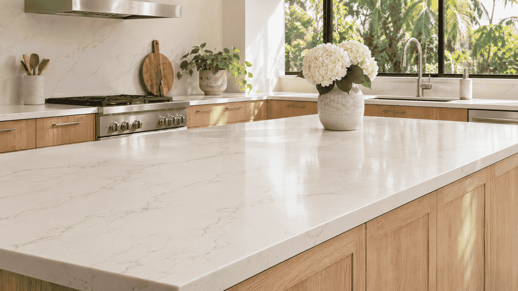

A white countertop can look soft and neutral in a showroom, then turn almost blue beside the honey oak cabinets in your kitchen. A cream sample might look right next to the cabinet doors but seem yellow as soon as you hold it against the backsplash. If you’re shopping for quartz countertops for a Tampa Bay home, bring a few samples into the room before picking a color. What matters is how the quartz looks alongside the oak, the floor, and everything else you plan to keep.
Look at the Oak You Have
“Oak cabinets” can mean pale wood with a clear finish, golden doors that have been in the kitchen for years, or dark brown cabinets with a prominent grain. The finish and the shape of the door both affect what looks good beside it. A plain oak door may look great with a lively countertop pattern, while a raised-panel door with a strong grain already gives your eye plenty to follow.
Pick a cabinet near the counter you’re replacing. In daylight, look for the color that stands out first. Does it lean gold, orange, tan, or brown? Then place a sheet of plain white paper against it. The paper gives you a reference point and makes the warmth of the wood easier to see. You don’t need to find a perfect name for the color. You just want to notice whether a countertop sample makes the wood look richer, paler, or more orange than you’d like.
If you can take a cabinet door or spare panel to the showroom, bring one from the kitchen itself. A photo is useful for remembering the room, but it’s harder to judge the relationship between two colors on a screen.
Compare a Few Whites Side by Side
Start with a few samples you can tell apart: a crisp white, a softer white, and a light beige or greige. Lay them flat on the counter and look at them from the doorway. A sample held upright at eye level can catch the light differently from a surface sitting below the cabinets.
A crisp white can make honey oak look brighter and give the kitchen a clean contrast. If the same white draws out more orange than you want, try a softer white with a subtle beige or gray cast. If you like a creamy counter, compare it with the floor and backsplash, too. A cream sample that looks good against the wood might seem out of place beside a cool gray tile you’re keeping.
Once you have a favorite, remove the other samples and look again. A soft white may look yellow beside a bright white sample, then settle into the room when it’s the only one on the counter. It’s the second view that tells you how the surface might feel in your kitchen.
Decide How Much Pattern the Room Needs
Oak grain can be quiet from across the room or visible from the hallway. If your cabinets have pronounced grain and the floor has a pattern of its own, try quartz with faint movement first. It can give the eye a place to rest between the two. If the doors are plain and the floor is understated, a stronger vein might give a long stretch of counter some character.
Pay attention to where the pattern will show. The little strip behind the sink may display only a small piece of a vein, while a wide island gives you room to see it travel. If you like a quartz design because of one sweeping line in a showroom display, ask to see a full slab or a large image of the design. A hand sample might show the background color without giving you much sense of the pattern you’ll see across the finished counter.
For a kitchen with a busy oak grain, try stepping back from the sample until you’re at your usual distance from the island or sink. If you still notice both patterns right away and enjoy the effect, there’s no need to tone it down. If you keep switching your attention between the two, a quieter countertop may be easier to live with.
Test the Colors Where You’ll Use Them
Put your two favorite samples beside the sink, then move them to the island or the darkest stretch of counter. Check them again after sunset with the lights you normally turn on to cook. In a Tampa Bay kitchen with sliding doors onto a lanai, a sample near the glass may look quite different from the same sample under an upper cabinet.
The evening check is especially useful if you cook after work. A pale beige that seemed almost white in the afternoon may read warmer under the lights you use to make dinner. A cool white that looked crisp by the window might feel stark against the wood at night. Decide which changes you like and which would bother you. No sample has to look identical all day to be a good choice.
Use the Surfaces You’re Keeping to Break a Tie
When two quartz samples look good with the cabinets, let the rest of the kitchen help you decide. If you’re keeping a tan tile floor, see which sample looks more at home above it. If the white backsplash is staying, place the samples against it and check the meeting point. Two whites can look close in isolation and quite different where they touch.
Cabinet hardware is useful as a final check. Black pulls might already provide the contrast you want, making a quiet countertop feel like enough. If you’re keeping brass knobs you love, see whether a warmer or cooler countertop makes the whole group look better to you. The knobs are easy to swap later, though, so give more weight to the finishes you’d rather live with for years.
Choose the One That Works on an Ordinary Day
Leave your favorite sample out for a day or two. Walk past it with the kitchen set up as usual, with the dish rack out, a cutting board on the counter, or the kids’ water bottles beside the sink. That’s a more useful test than looking at it only after you’ve cleared and styled the room.
If you’re torn between two colors, go back to the reason you’re replacing the countertop. Maybe you want a dark kitchen to feel lighter, or maybe you like your oak doors and want a surface that brings out the grain. Pick the sample that does that job in your room, under your lights. It’s much easier to trust that choice once you’ve seen it beside the oak on a regular Tuesday night.
